
Have you ever walked into a room that felt instantly calming yet visually striking? That magical sense of order isn’t accidental—it’s often rooted in a 2,400-year-old principle used by artists, architects, and now interior designers. This invisible blueprint for beauty appears everywhere in nature, from seashell spirals to flower petals.
At its core, this concept revolves around specific proportions that create natural harmony. Think of it as a recipe where ingredients—like furniture sizes or artwork placement—combine in precise measurements. When done right, spaces feel cohesive without looking overly calculated.
Modern designers lean on this strategy to solve common dilemmas. Should your sofa take up 60% or 70% of the wall? How large should a coffee table be relative to seating? The answers often lie in this timeless formula, helping rooms achieve that “just right” feeling we all crave.
Key Takeaways
- Ancient mathematical principles influence today’s most appealing interiors
- Proportional relationships create instinctive visual harmony
- Specific measurements (approximately 1.6:1) guide layout decisions
- Works for any space size or design style
- Simplifies choices like furniture sizing and decor placement
Ready to crack the code professionals use? We’ll show you how to apply these principles without complex math. You’ll learn to arrange spaces that feel effortlessly put together—like they’ve always belonged exactly as they are.
Understanding the Golden Ratio in Home Decor
The secret to harmonious spaces lies in a mathematical formula older than the Parthenon. This timeless principle acts like an invisible grid, helping designers create rooms that feel instinctively right to our eyes.
What Makes This Formula Special?
Known as Phi (1.618), this proportion divides elements so the smaller part relates to the larger like the larger relates to the whole. Picture a sofa taking up 61.8% of a wall, with remaining space for side tables – that’s Phi in action.
“Great design isn’t about rigid rules – it’s about relationships between elements.”
Why Our Brains Love These Patterns
Neuroscientists found we process balanced layouts 17% faster than chaotic ones. This explains why sunflower seed spirals and hurricane cloud formations feel oddly satisfying:
| Natural Pattern | Proportional Relationship | Design Application |
|---|---|---|
| Nautilus shell | 1:1.618 spiral growth | Curved furniture layouts |
| Pinecone scales | 8:13 seed arrangement | Accent wall tile patterns |
| Human face | Eye-to-chin ratio | Mirror placement heights |
Modern research shows rooms using these proportions reduce stress hormones by up to 24%. It’s why art museums and luxury hotels use this strategy – now accessible for any living space.
Historical Influence of the Golden Ratio on Interior Design
Imagine walking through a museum where every room feels perfectly balanced. That’s no accident—designers have borrowed mathematical secrets from history’s greatest creators for centuries. Ancient civilizations first noticed these harmonious patterns in nature, then translated them into breathtaking structures.
From Temples to Living Rooms
Greek architects built the Parthenon using proportions found in pinecones and seashells. Their 5th-century BC designs still influence luxury hotels today. Renaissance genius Leonardo da Vinci later proved these measurements create universal appeal—his Vitruvian Man drawing remains a blueprint for spatial harmony.
“Art and science must work together to reveal nature’s hidden order.”
Modern designers mix old rules with new styles. A Barcelona apartment might pair 18th-century moldings with sleek, ratio-based furniture layouts. High-end restaurants use the same balance principles as medieval cathedrals—just swap stone arches for statement lighting.
| Era | Architecture Example | Modern Interior Use |
|---|---|---|
| Ancient Greece | Parthenon columns | Floor-to-ceiling bookcase spacing |
| Renaissance | Da Vinci’s sketches | Sectional sofa configurations |
| 21st Century | Luxury hotel lobbies | Open-concept room divisions |
This timeless approach explains why certain spaces feel special. When proportions mirror those found in sunflowers or storm patterns, our brains recognize the familiar rhythm. It’s history working through your floor plan.
Implementing the Golden Ratio in Home Decor Techniques
Transform your space with designer-approved techniques that make proportion work for you. These strategies help create rooms that feel both intentional and inviting.

Color Harmony Made Simple
The 60-30-10 formula simplifies color decisions. Start with a dominant shade covering walls and large pieces like sofas. This base color should feel neutral enough to build upon.
Next, choose a secondary tone for soft furnishings and window treatments. This 30% layer adds depth without competing. Finally, inject energy with vibrant accents in art or decorative objects—just 10% keeps things lively but balanced.
“Color proportions act like visual rhythm—they guide the eye without shouting for attention.”
Smart Space Division
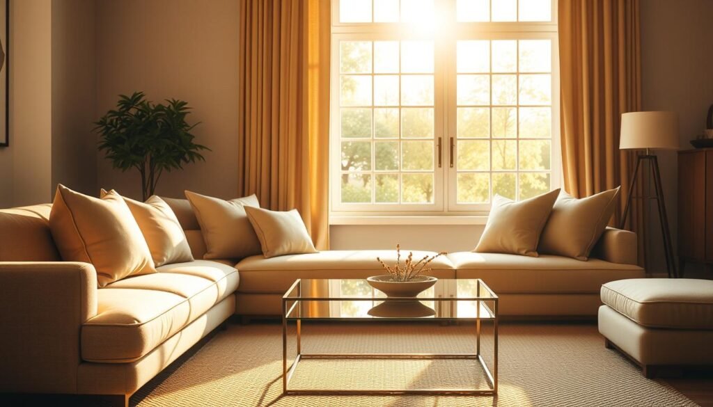
Arrange seating using the 1.6:1 proportion. A sofa facing two chairs creates natural balance. Measure wall areas to determine ideal furniture sizes—your largest piece should occupy about 60% of available space.
| Element | Color Percentage | Examples |
|---|---|---|
| Foundation | 60% | Walls, sectionals, area rugs |
| Support | 30% | Curtains, accent chairs, table lamps |
| Spark | 10% | Throw pillows, vases, framed art |
These principles adapt to any layout. Small apartments can use scaled-down versions, while open-concept spaces benefit from zoned areas following the same ratios. The result? Rooms that feel effortlessly complete.
Golden Ratio in home decor: Creating Balanced and Harmonious Spaces
That awkward feeling when your living area seems slightly unbalanced? It’s usually a spacing puzzle solved by proportional design principles. Strategic arrangements make rooms feel complete without crowding.

Optimizing Furniture Layout & Space Planning
Start by dividing your floor plan using the 62/38 split. Allocate 62% for main activities like seating areas, leaving 38% for walkways and accent pieces. This creates rhythm without empty dead zones.
Pair larger items with medium-sized companions. A 96″ sofa teams perfectly with a 60″ coffee table (96 ÷ 1.618 ≈ 60). This scaling makes groupings feel intentional rather than random.
“Great spaces dance between function and beauty—the math just helps them waltz instead of stumble.”
| Primary Piece | Companion Item | Ideal Proportion |
|---|---|---|
| Sectional sofa | Media console | 1.6:1 length ratio |
| Dining table | Light fixture | 2:3 width match |
| Bed frame | Nightstands | 38% of bed width |
Maintain clear pathways measuring at least 24% of the room’s length. This ensures comfortable movement while preserving visual flow. In tight areas, use nesting tables instead of bulky ottomans.
For multi-use zones, layer rugs at 60% of the floor space. Anchor your main seating on the larger rug, then add a secondary rug for reading nooks or workspaces. This defines areas while keeping proportions pleasing.
Integrating Architectural Elements and Decorative Accessories
Balancing architectural features with decor isn’t just about taste—it’s science. The right proportions turn structural details and accent pieces into partners rather than competitors.
Ideal Wall Art Placement
Hang artwork at 62% of the wall height from the floor—the sweet spot where human eyes naturally focus. This measurement works whether you’re 5’2″ or 6’4″, creating universal appeal.
For gallery walls, apply the 1.6 spacing rule. Leave 1.6 inches between small frames and 16 inches between large pieces. This rhythm feels intentional without looking rigid.
“Art should converse with architecture, not compete with it.”
Optimizing Ceiling Heights and Windows
Multiply your room’s width by 1.6 to find the ideal ceiling height. A 12-foot-wide space shines with 19-foot ceilings, while 8-foot widths feel airy at 13 feet.
| Architectural Feature | Proportional Rule | Design Impact |
|---|---|---|
| Windows | 1:1.6 (height:width) | Maximizes natural light flow |
| Doorways | 38% of wall space | Creatines graceful transitions |
| Light fixtures | 60% of table length | Balances scale in dining areas |
Accessories follow the same rules. A 24-inch vase pairs perfectly with a 15-inch side table. Plants in 10-inch pots complement 16-inch floor lamps. Every element supports the room’s mathematical harmony.
Enhancing Functionality through Proportion and Layout
That moment when your favorite chair suddenly feels too bulky? It’s usually a sizing mismatch disrupting your room’s flow. Strategic scaling transforms awkward spaces into welcoming environments where every piece serves a purpose.
Smart Pairing for Everyday Living
Measure your sofa’s length first—this becomes your anchor measurement. Companion pieces should measure roughly 60% of this size. A 90-inch couch pairs best with a 54-inch coffee table, creating comfortable reach without cramping legroom.
“Proportions aren’t about perfection—they’re about creating relationships that make daily life easier.”
Consider traffic patterns when arranging seating. Leave 24-36 inches between furniture edges for natural movement. In tight spaces, opt for nesting tables instead of large ottomans—they offer flexibility without visual weight.
| Primary Piece | Ideal Companion | Functional Benefit |
|---|---|---|
| 84″ Sofa | 50″ Console | Creates balanced TV viewing |
| 60″ Dining Table | 36″ Buffet | Enhances serving space |
| Queen Bed | 22″ Nightstands | Improves bedside accessibility |
Multi-functional rooms thrive with zoned layouts. Use area rugs to define spaces—your main rug should cover 60% of the floor area. Smaller rugs can anchor reading nooks or workspaces while maintaining overall harmony.
Test arrangements by temporarily placing pieces with painter’s tape outlines. This trick helps visualize proportions before committing heavy lifting. Remember: Comfortable spaces feel right before they look right.
Conclusion
Designing a space that feels just right isn’t magic—it’s math. The golden ratio gives you a blueprint for creating rooms where every piece naturally belongs. Now that you understand this design principle, you can arrange furniture, choose colors, and style shelves with newfound confidence.
Professional designers rely on these proportions because they speak to our innate sense of order. Your living area becomes more than a collection of things—it transforms into a cohesive environment where harmony and function coexist. Even small tweaks, like adjusting artwork heights or resizing accent tables, yield noticeable improvements.
This ancient concept remains vital in modern interior design because it mirrors patterns we recognize instinctively. From sofa placements to lighting choices, balanced proportions make spaces feel inviting rather than overwhelming. Your home becomes a testament to thoughtful planning, not strict formulas.
Ready to experiment? Start with one room and apply the 1.6:1 relationship between key elements. Notice how room feel shifts from “almost there” to “exactly right.” Great design isn’t about rigid rules—it’s about using timeless principles to craft environments that truly work for you.